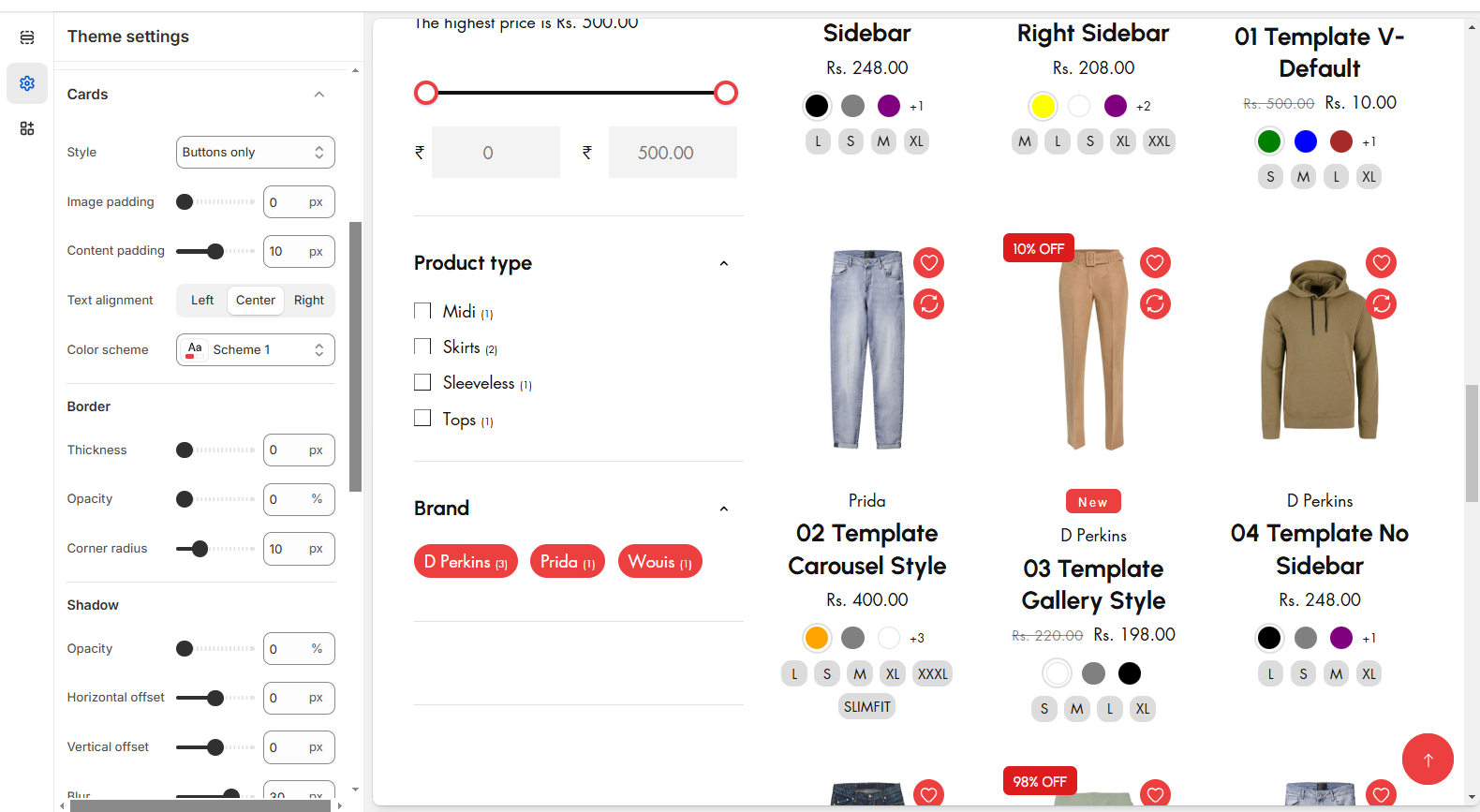
NextEuv
  • NextEuv - EV Shop, Single Product Shopify Theme
  • Getting Started
    • Shopify
    • Theme features
    • Changelog
    • Support Policy
  • How to install Theme
    • Download the Theme Package
    • ThemeForest - Theme Files
    • Theme Installation
  • Header Group
    • Announcement bar
    • Top bar
    • Selectors
    • Header
    • How to add navigation
    • Navigation menu
    • Account Page
  • Menu & Mega Menu
    • Mega menu with Promo Image
    • Mega menu with Promo Banner
    • Mega menu with Brands
    • Mega menu with Product
    • Mega menu with Tab Menu
    • Mega Menu Creation-video
  • Footer Group
    • Footer
      • Menu
      • Newsletter
      • Text
      • Contact Info Block
    • GRDR Cookies
    • Email Signup
    • Suggestion Product
  • Product
    • Creating Products
    • Product Variants
    • Recommended Products
    • Metafield
    • Gift Cards
  • Collections
    • Collection List
    • Creating Collections
    • Collection Banner
  • Filters
    • Filters
    • Horizontal Filter
    • Vertical filter
    • Drawer Filter
    • Paginations
  • Theme Settings
    • Colors
    • Preloader
    • Typography
    • General Settings
    • Layout
    • Buttons
    • Variant pills
    • Inputs
    • Cards
    • Content Containers
    • Dropdowns and Pop-ups
    • Drawer
    • Badges
    • Search Behaviour
    • Favicon
    • Social Media
    • Currency format
    • Cart
    • Shipping Rates Calculator
  • Pages
    • About Us
    • Contact
    • FAQ page
    • Wishlist
    • Compare
  • Blog
    • Default blog
    • Creating Blog
    • Default blog post
  • Sections
    • Slideshow
    • Support Block
    • Featured Collection
    • Instagram Gallery
    • Email signup
    • Team Section
    • Image banner
    • Video
    • Testimonial
    • Specification Block
    • Brand Logo
    • Deal banner
    • Form Image
    • Grid banner
    • Marquee Section
    • Number Counter
    • Pricing table
    • Product tab
    • Rich text
    • Custom Class
  • App Integration
    • App Integration
    • Recommended Apps
  • Video Tutorial
    • How to Install Shopify Theme
    • How to Add Megamenu
    • How to Display Inner Pages
    • Multiple Collections in One Product Tab on Shopify
    • How to edit the product details
    • How to add variants for products
    • How to create a blog post
    • How to Customize Header and Section
    • How to Edit Language Translation and Missing Translations
    • How to Set Up and Use Metafields
    • How to edit font in Shopify?
    • How to Create a Staff Access and Collaborator Access
  • Frequently Asked Questions
    • Missing template "layout/theme.liquid"
    • Image Purchase link
Powered by GitBook
On this page
  1. Theme Settings

Cards

PreviousInputsNextContent Containers

The Cards consist of Product cards, Collection cards, and Blog cards allowing you to customize the style of each type of card when they're displayed in page sections. You can also customize the desired colour, alignment, image padding, borders, and shadows of these three types of section cards.

Step 1 : From your Shopify admin, go to Online Store > Themes.

Step 2 : Find the theme that you want to Edit and Click Customize.

Step 3 : Click Theme Settings.

Step 4 : Theme Settings > Cards.

  • The card consist of different types of styles can select the required style according to the theme need

  • The padding of the card is adjusted using this Image padding and Content padding

  • Text alignment is used align the card content alignment (Left,Center,Right) and color schema ensure to add color of the card

  • Border and Box shadow can also be adjusted using above options.